Reusable interface patterns
Compose forms, navigation, tables, dialogs, application layouts, and utilities from one maintained package.
Grove provides reusable, accessible, and themeable React components for custom digital health and research applications.
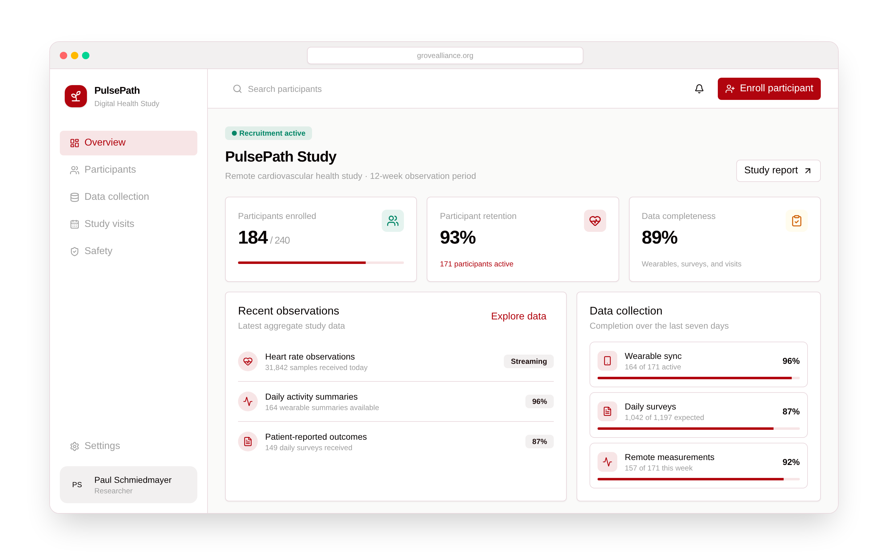
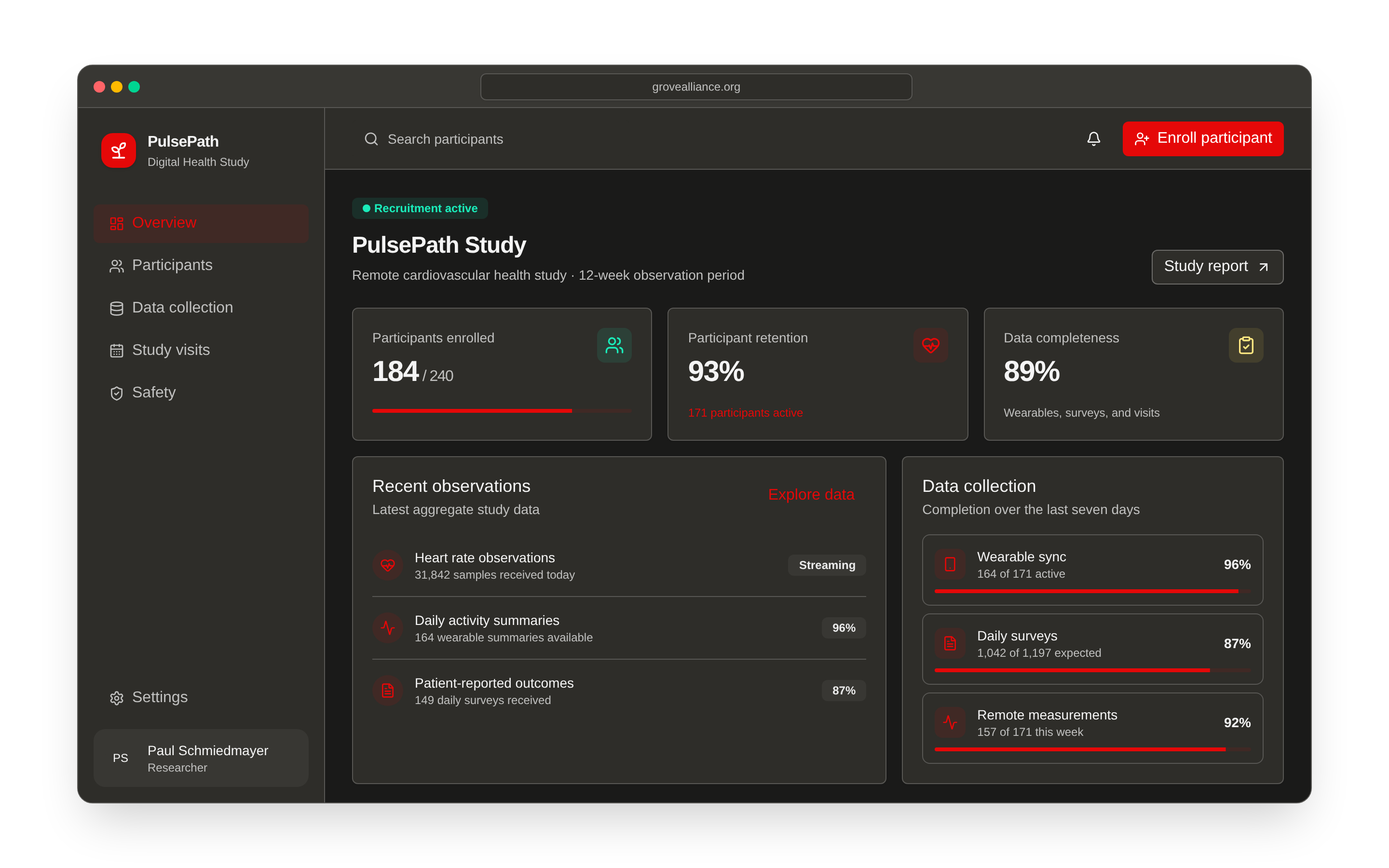
Designed to work together
Adopt individual components or use Grove as the interface foundation for an entire application.
Compose forms, navigation, tables, dialogs, application layouts, and utilities from one maintained package.
Build on keyboard-aware, screen-reader-friendly primitives with consistent focus and interaction patterns.
Use built-in light and dark themes, follow system preferences, or provide custom design tokens.
Develop with strict TypeScript contracts and modern React patterns that make integrations easier to maintain.
Start with opinionated defaults and adapt them through Tailwind CSS, semantic tokens, and class overrides.
Rely on automated tests, coverage gates, package validation, and continuous security checks.
Start with one package
Install the design system, wrap your application once, and let Grove follow the browser or operating-system appearance.
Read the installation guidenpm install @schmiedmayerlab/grove-design-system
<GroveProvider
router={routerProps}
colorScheme="system"
>
<App />
</GroveProvider>Browse live examples, component states, and usage guidance in Storybook.